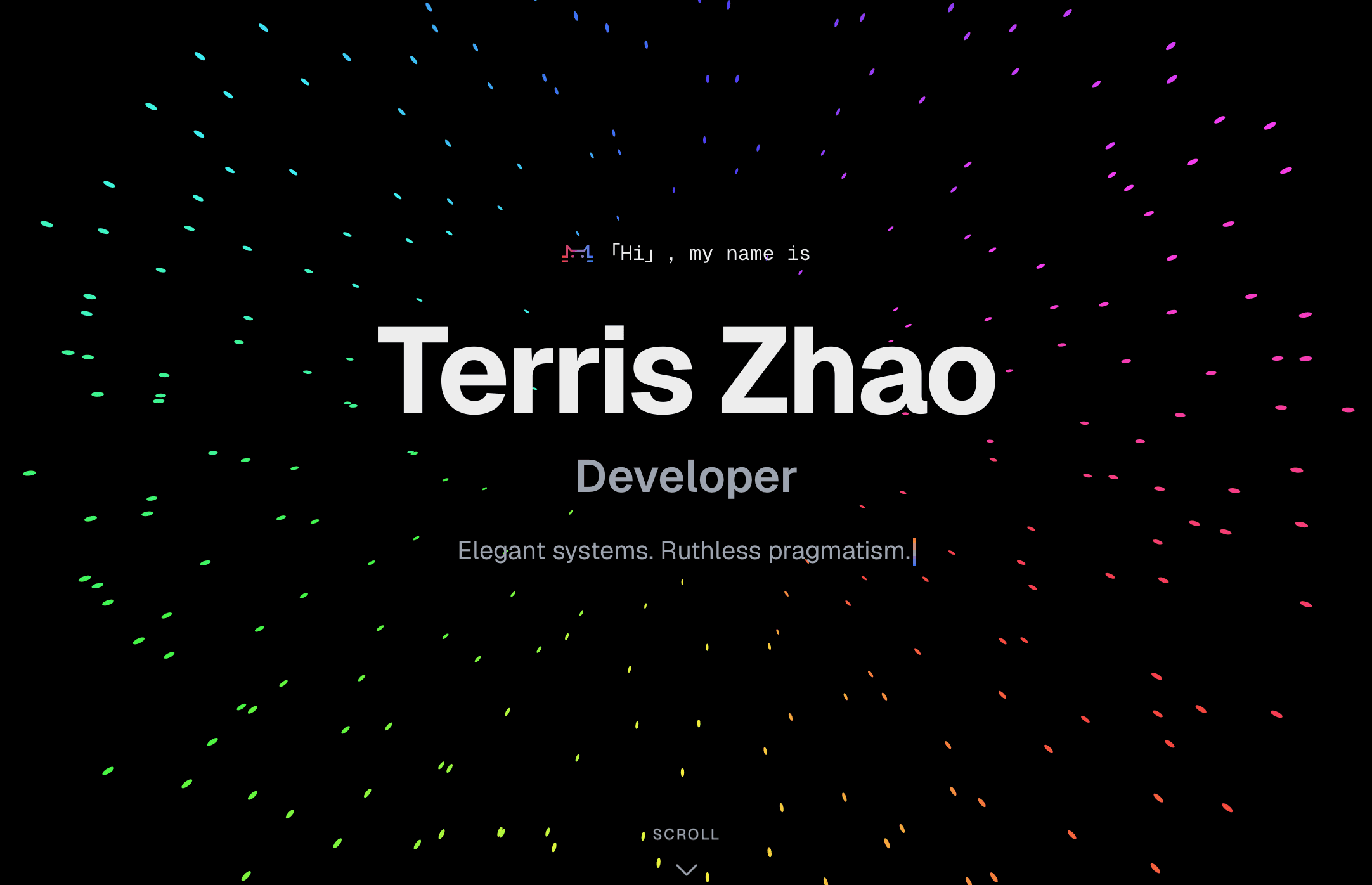
Starting Point
Most developer portfolios look the same — a name, a list of skills, a grid of projects, a contact form. I wanted something that felt alive without being noisy. The constraint I set for myself: every visual detail had to serve a purpose.
The stack I landed on: Next.js 16 App Router, HeroUI, Tailwind CSS 4, Framer Motion 12, and next-themes for dark/light mode.
App Router and Server Components
Next.js App Router changes how you think about data. The portfolio has no CMS or API — all content lives in lib/data.ts as typed constants. Server components read that data at build time and render zero client-side JavaScript for the static sections. Only the animated parts opt into "use client".
The result: the page ships with a near-zero JavaScript bundle for content, and Framer Motion code only loads where it's actually needed.
Scroll-Driven Animations
Framer Motion 12's useScroll and useTransform make scroll-linked effects declarative. The contact card uses a "jelly pop" pattern — scaling from 85% to full size as it enters the viewport, with a spring wrapper for the elastic feel:
const { scrollYProgress } = useScroll({ target: ref, offset: ["start end", "end end"] });
const scale = useTransform(scrollYProgress, [0, 0.6], [0.85, 1]);
const y = useTransform(scrollYProgress, [0, 0.6], [60, 0]);
const scaleSpring = useSpring(scale, { stiffness: 120, damping: 20 });
const ySpring = useSpring(y, { stiffness: 120, damping: 20 });
The useSpring wrapper is the key — without it, scroll animations feel mechanical. With it, they feel physical.
For section reveals, a ScrollReveal wrapper uses useInView with a -100px margin so elements start animating just before they're fully visible:
const ref = useRef(null);
const isInView = useInView(ref, { once: true, margin: "-100px" });
Tailwind CSS 4 and CSS-First Theming
Tailwind v4 replaced the tailwind.config.js token system with @theme inline blocks in CSS. Theme tokens are now CSS variables, which means dark mode is just a class swap — no JavaScript involved:
:root {
  --primary: #3b82f6;
  --card: #ffffff;
}

.dark {
  --primary: #60a5fa;
  --card: #18181b;
}

@theme inline {
  --color-primary: var(--primary);
  --color-card: var(--card);
}
Every Tailwind utility that references primary or card now responds to the .dark class automatically. next-themes handles toggling the class on <html>.
HeroUI for Structural Components
HeroUI (formerly NextUI) handles buttons, dividers, and layout primitives. It pairs naturally with Tailwind and respects the CSS variable theme, so customization is minimal — you're mostly composing, not overriding.
What I'd Do Differently
Mobile-first from the start. I built desktop layouts first and retrofitted responsive styles. The contact card in particular needed three rounds of mobile adjustments. Starting from the smallest viewport and expanding outward is strictly easier.
Fewer animation variants. I defined separate FadeIn, ScrollReveal, and StaggerContainer components but they share 80% of the same logic. A single configurable Motion primitive would have been cleaner.
What Came Next
The blog you're reading was added after the initial launch — markdown files parsed with gray-matter, rendered with react-markdown. Adding a new section to a well-structured Next.js project is genuinely fast when data, types, and layout concerns are cleanly separated from the start.